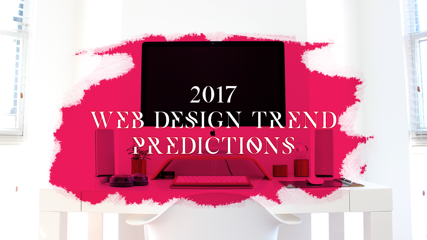
 I’ll be looking into what 2017 will bring in the world of web design. Now, I don’t have a crystal ball and can’t be 100% sure how web design trends will exactly evolve, I can try to predict how web it may progress this year by building upon my experience of what I saw slowly emerging throughout 2016.
1. Typography: Big and Bold fonts
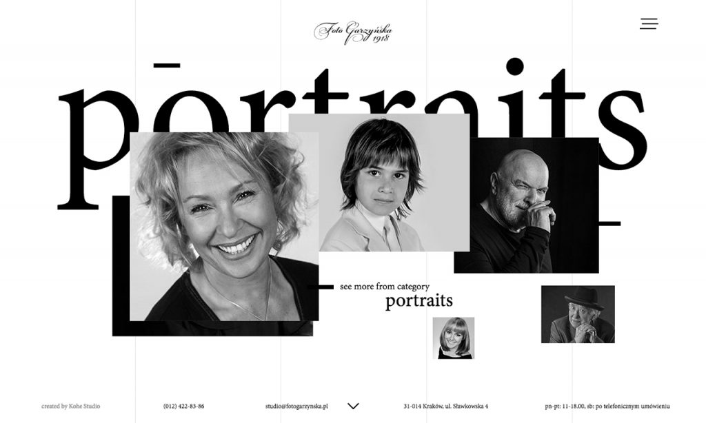
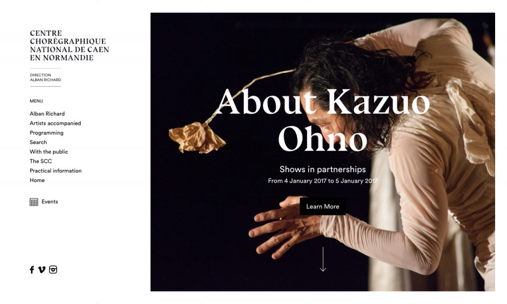
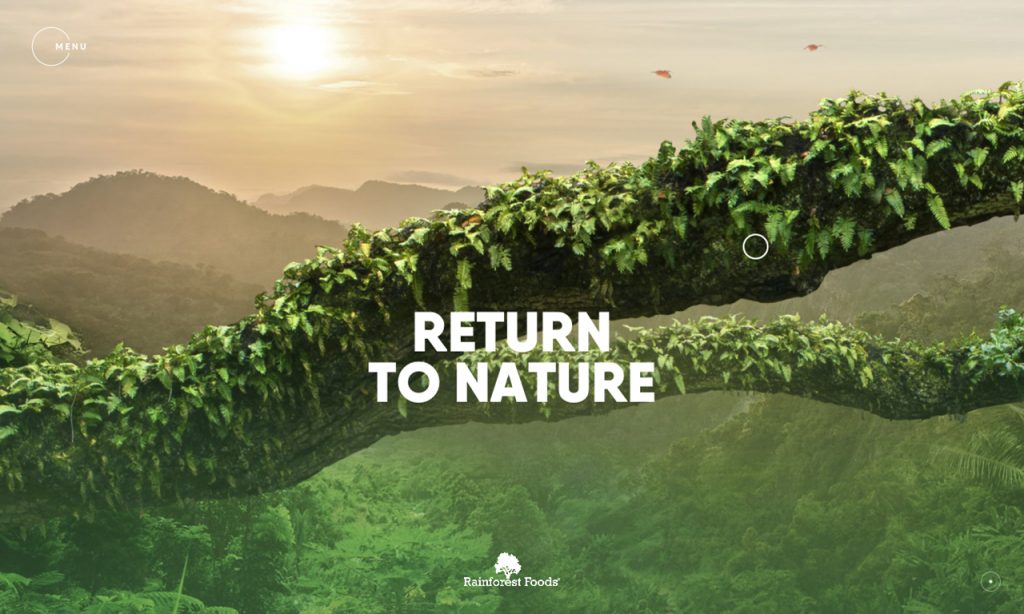
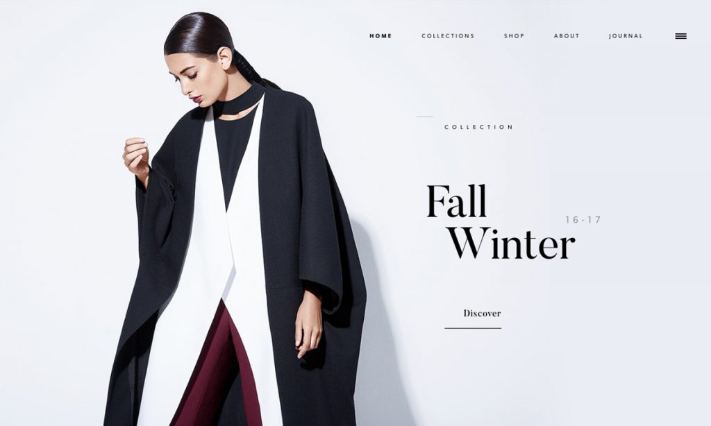
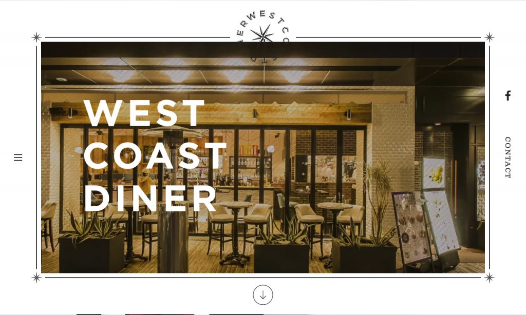
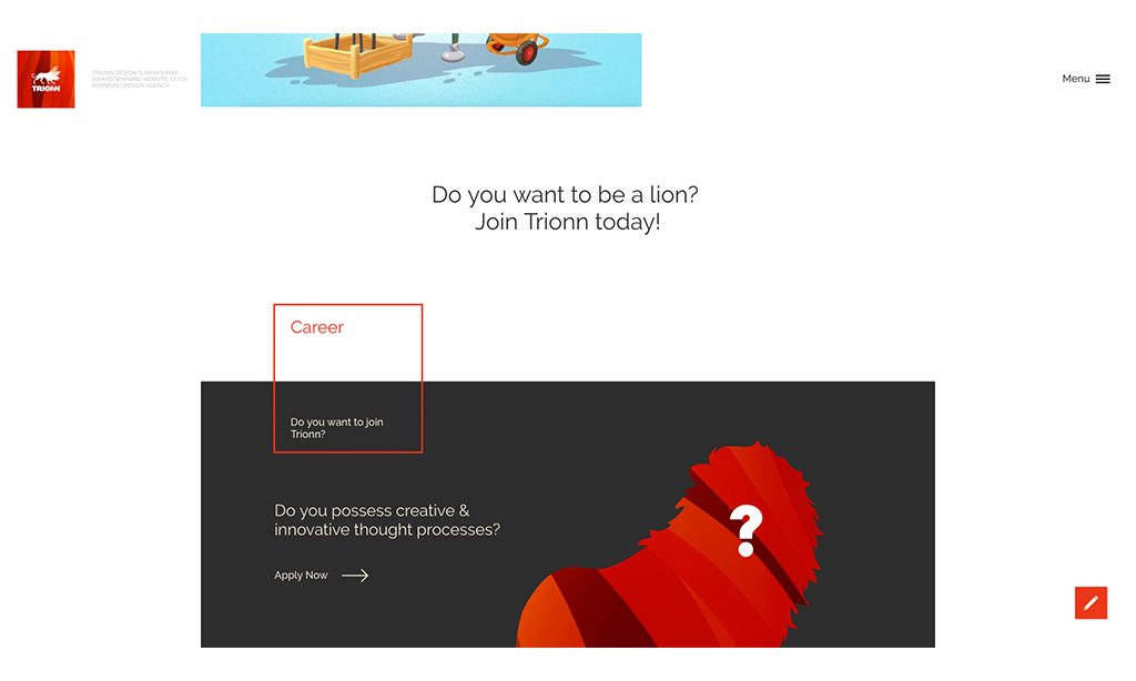
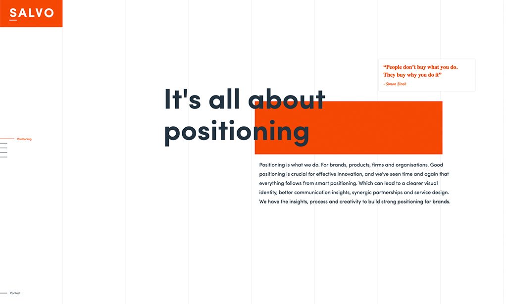
The use of big, bold typography will become even more common, last year I saw a rise in the use of large heading font sizes which created powerful and captivating visuals. The style allowed better use of minimalistic design as 2016 design in majority was more about quality over quantity. This type of typography captures the user’s attention and informs them of what the section they are going to read is about without having to read the small copy.
A mix of semi-small fonts with big headings can be expected to be used even more in 2017 with a wider range of custom fonts.
2. Photography: Decline in the use of stock photography
For the last year or two there has been a big decline in the use of stock imagery, which resulted in designs becoming more unique. This was all due to companies wanting to have more personality and uniqueness to their image, and with the rise of different professional free photography resource sites it’s much easier to find imagery that defines how you want to be perceived.
We can clearly say that in 2017 the use of free professional imagery is going to be even more widely used, with a much wider selection of amazing photographs that designers will be able to use.
Link to a post containing a small collection sites where you can find free professional images
3. Gradients and Overlays: The rise of overlays and overlapping
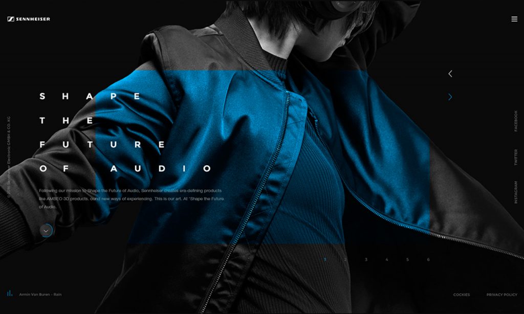
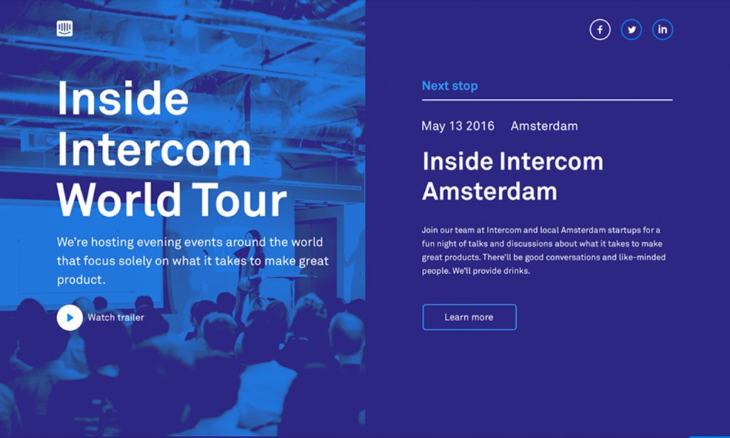
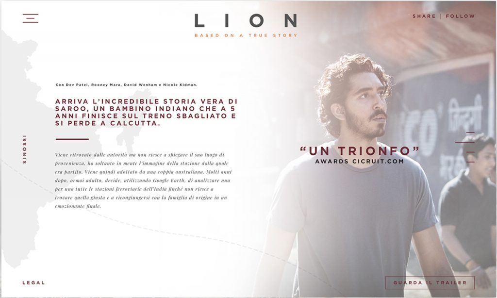
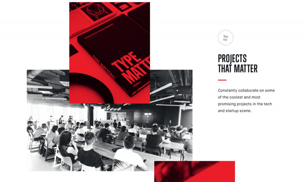
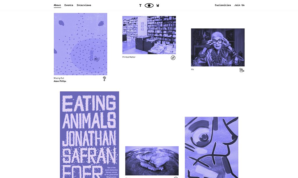
An emerging new trend that has been on the rise, using colour and overlapping photography. This new subtle but powerful style captivates the user’s attention to the areas that we as designers want the user to see first.
We can confidently assume that this will continue and be visible much more in 2017 with potential of seeing gradients coming into play to achieve a similar result. As gradients can be applied really easy without having to cut out “png’s” like in the good old days. Using gradients is something that I will be trying to use quite bit more in 2017.
4. Colours: Simplified colour palettes
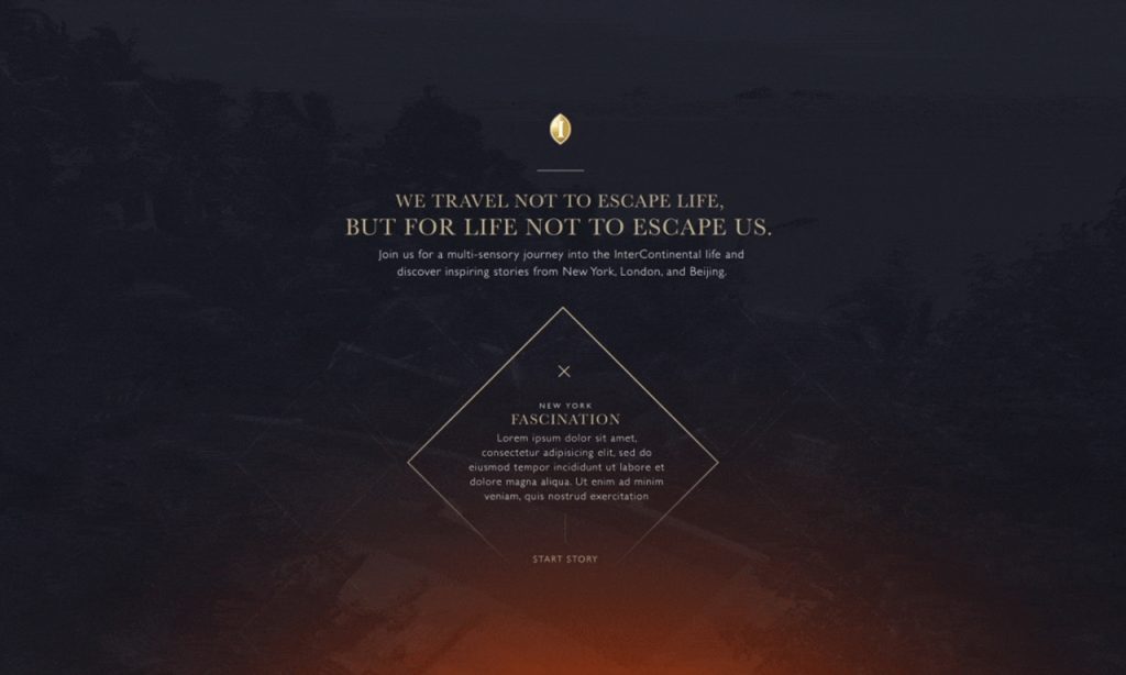
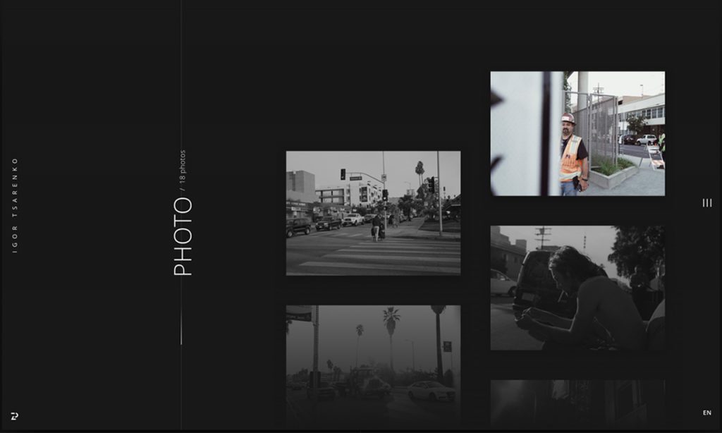
2016 has been a colourful year, we have seen great examples of amazing colour pallets. A colour style that has been seeing a lot more of uses a range of small colour palates, using black and grey as the main typography font colours while using a single strong/bright colour for points of interest. It has come around applying UX thinking by strategically placing the colour where you want the user to make the action, or to look first. This allowed the user viewing your website to instinctively knows that if he wants something to happen he can recognise the call to actions by colour, almost like an instinctive reflex.
5. Shadows: Bring shadows back
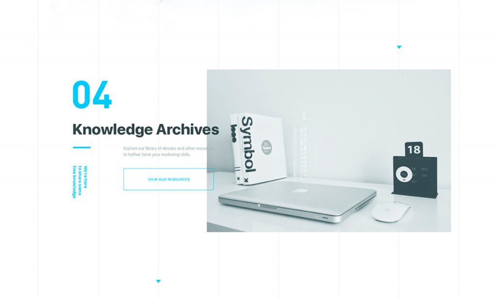
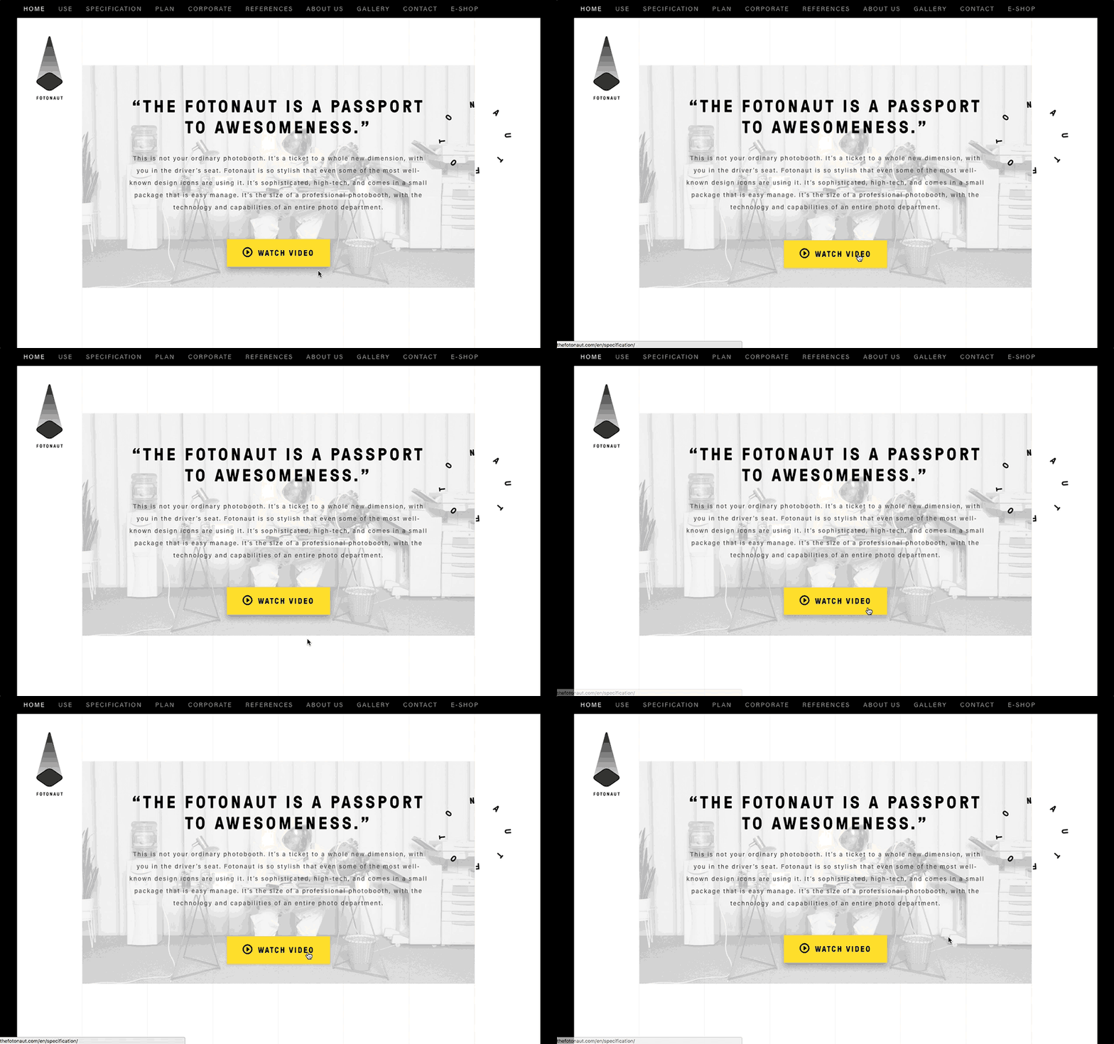
We are likely to see shadows returning, and it’s going to be exciting. In the earlier days shadows we being overused everywhere (e.g. behind large text, behind images, behind buttons etc…).
Now we are seeing shadows being used carefully and they can lead to amazing results if done correctly and most importantly not over used! By applying shadows on areas where the users can interact especially for tablets and phones can create the call to actions come alive as if pressing a real button. Using shadows for elements like buttons straight away gives a feeling as if you’re pressing a real physical button as they can be linked to the devise giving of light vibrations to indicate that you pressed the button, which brings us to our next point.
6. VR: Integrating VR into web design
Virtual reality is the new tech that everyone is excited about, it’s becoming more widely used and there are many exciting developments upcoming for this new tech that’s going to be a lot of fun.
One potentially big change that could happened this year or soon in the future is VR ready websites. Currently there’s a few downsides to VR (unless you’re willing to spend a lot of money on the top spec gear). One of the main downsides is that you physically get tired of having a VR headset on for a decent amount of time, as it makes people fill tired and puts stress on their eyes. Therefore, VR once it becomes a little more affordable and comfortable then it is going to be a new age for digital design.
7. Animations: Increase in variety of animations
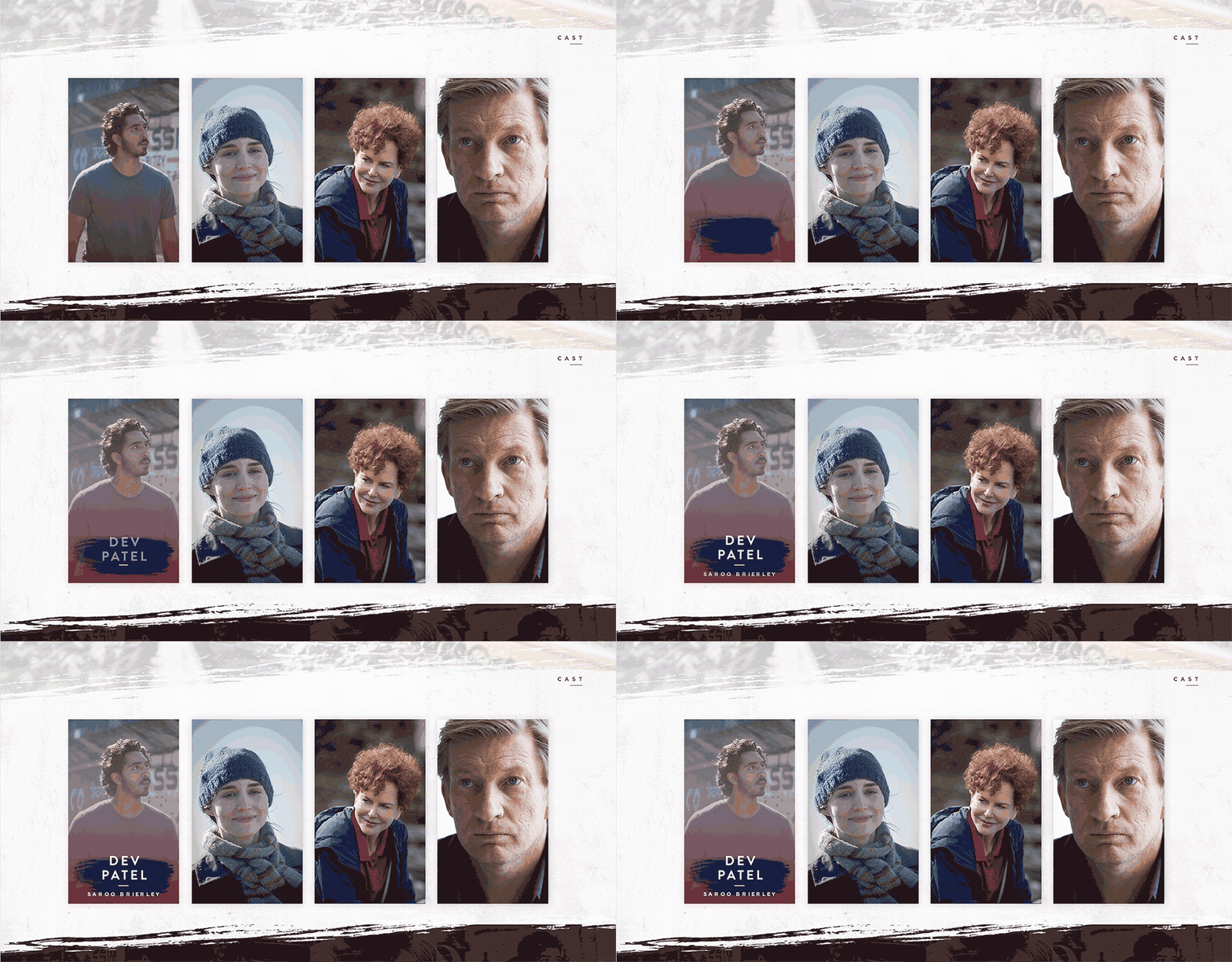
We have seen some amazing variety of animations in 2016 and I can’t wait to see what 2017 will bring. But there will be a big rise in micro animations for various elements such as titles, buttons etc. This will help make designs be more interactive, interesting and give a feeling of a complete product. One of the best things that a designer can do is create a design that users will spend time exploring and enjoying the finished product.
I suspect that in 2017 web design is going to be very interactive, especially the fact that VR is on our doorstep therefore its quite easy to see that the digital world is heading towards emersion and interactivity, making clarity and ease of use one of the key factors.
8. Grids: More custom and broken layouts
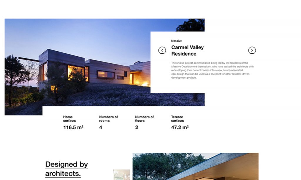
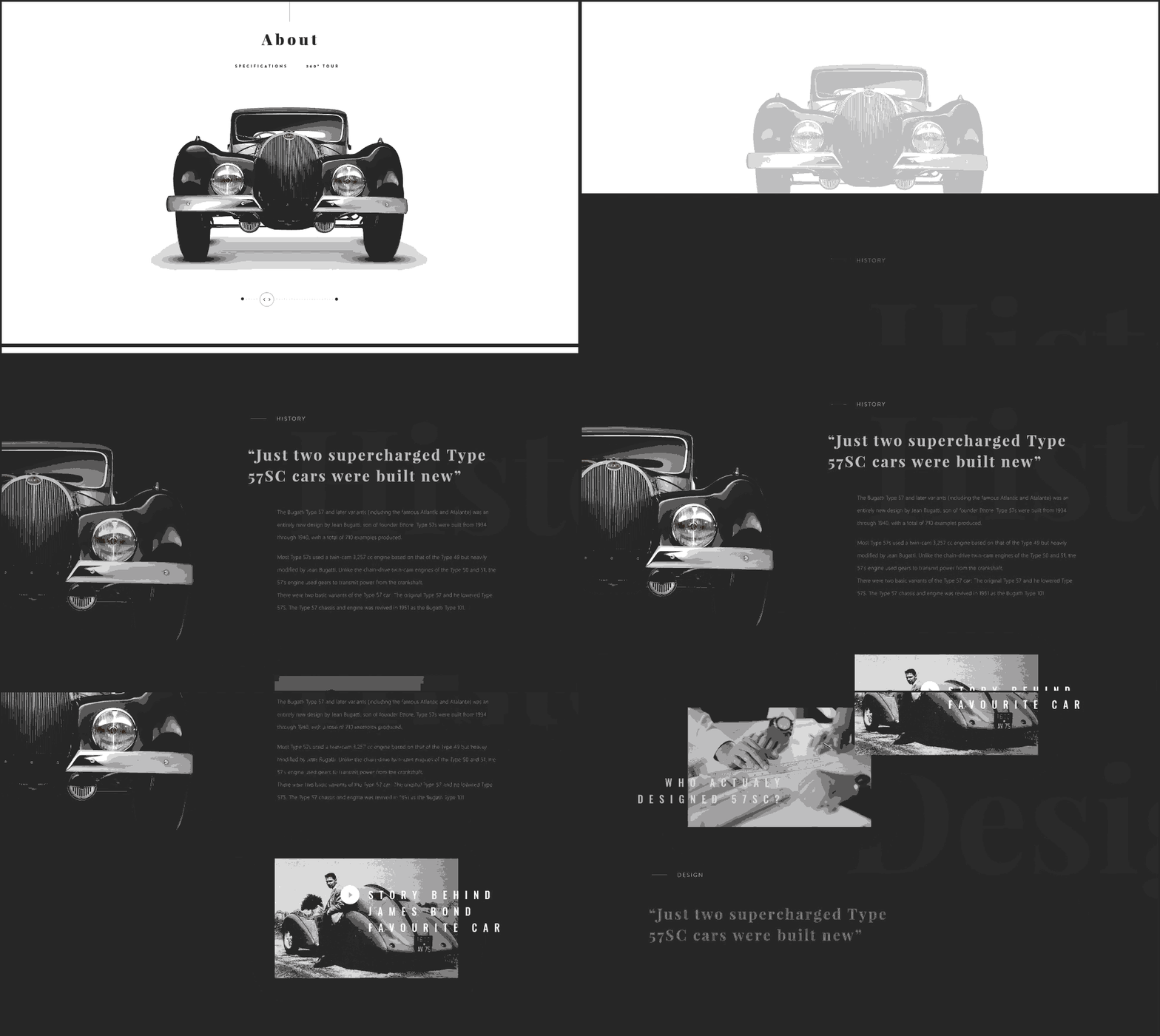
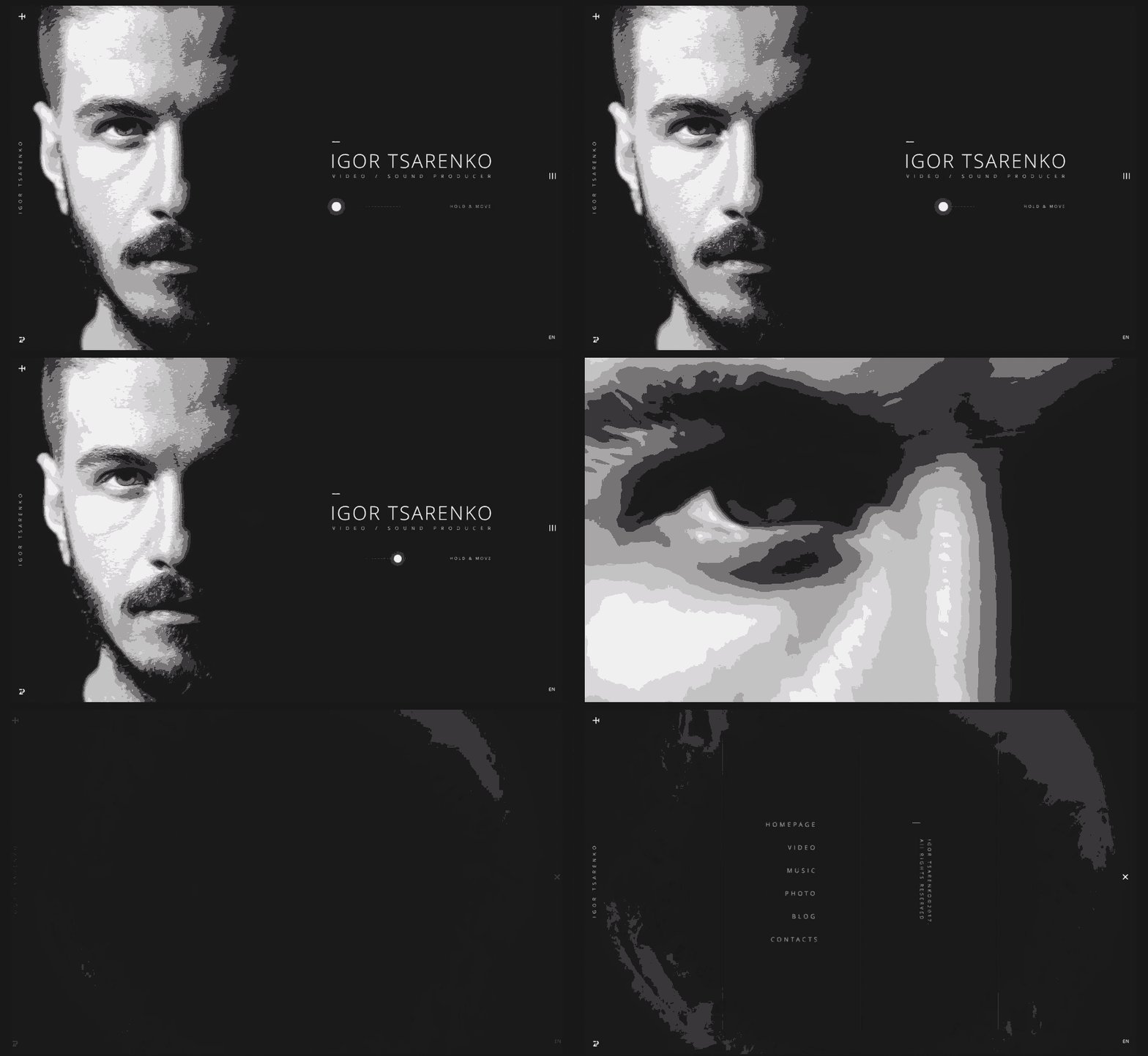
We have seen a large trend of using custom grids, breaking away from the normal and using the canvas as a way of capturing attention and displaying only vital information that you want the user to take in, rather than scroll past because there is just too much content to read.
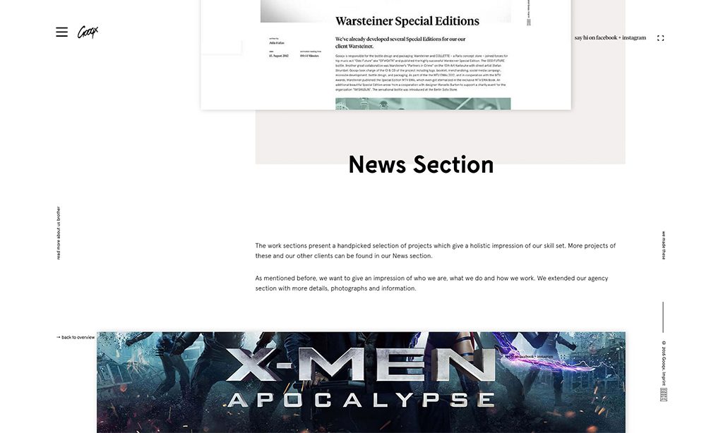
In 2017 I think this trend is going to continue and evolve even more, we will see more custom and broken grids, almost making every section of the website feel like an art piece rather than compilation of repetitive elements.
9. Use of Space: A lot of white space
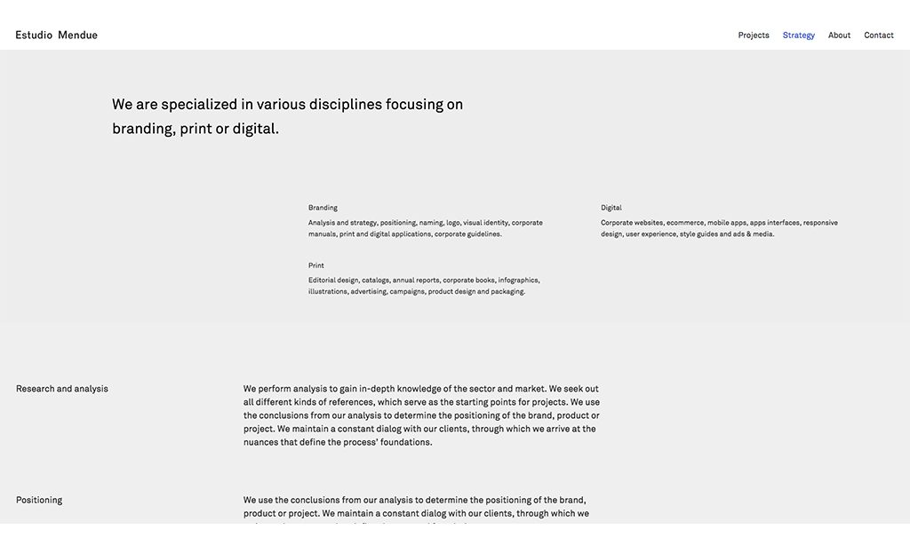
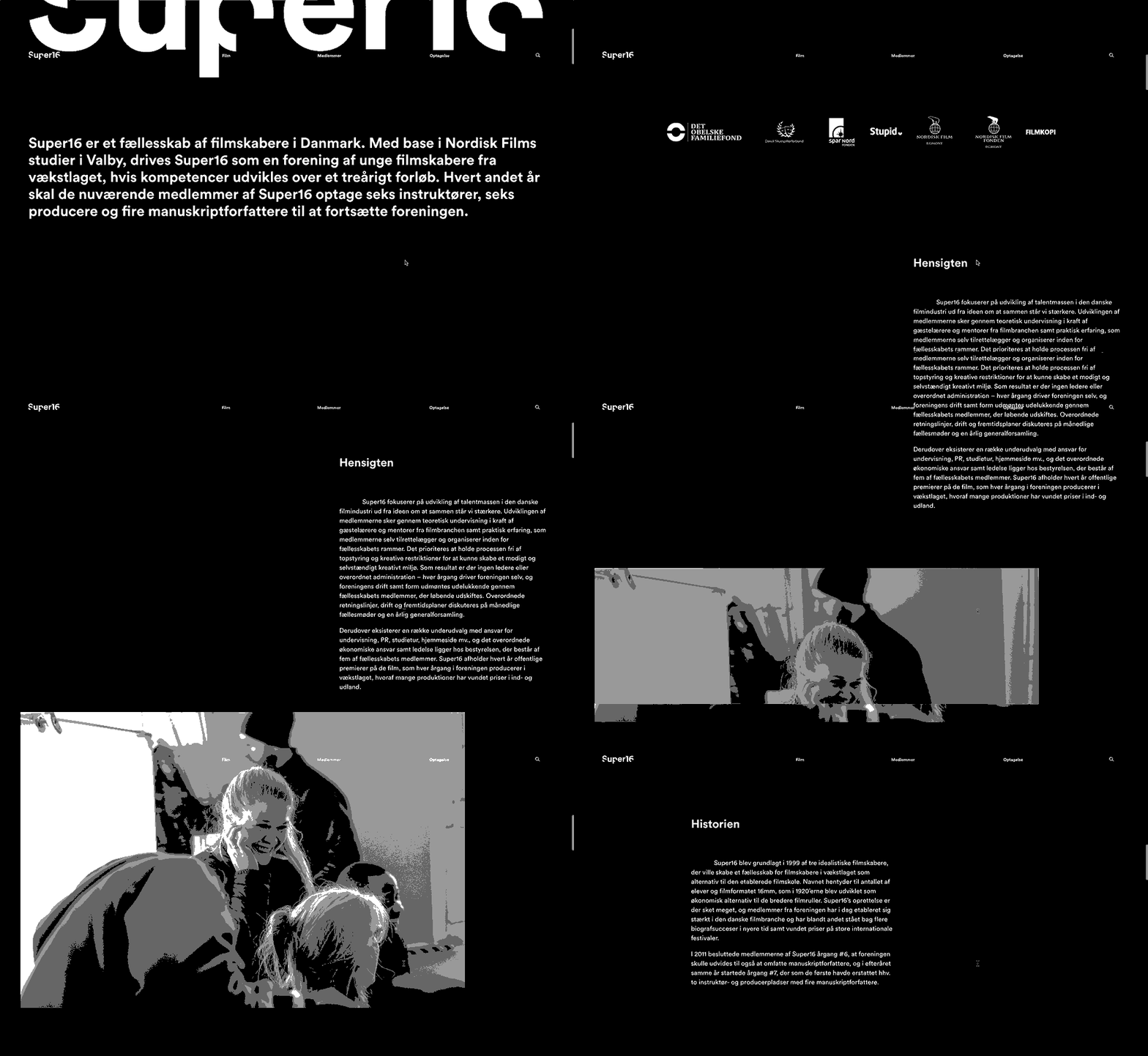
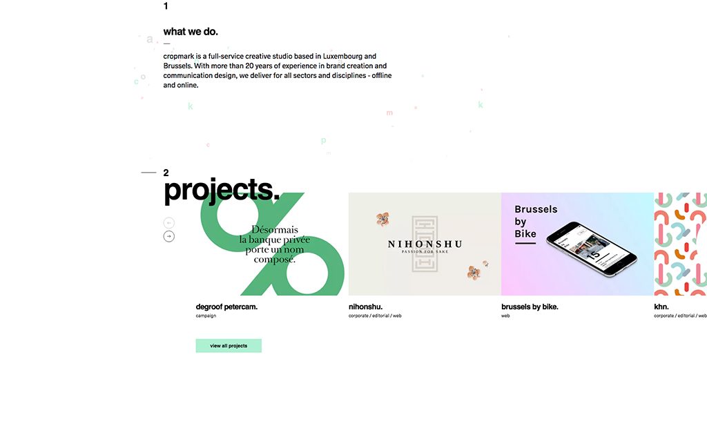
In 2016 the general layout composition was great, there was so much to explore and play around with. White space played a huge part in this aspect, once of the main trends was to spread different sections on the page out. No more compact, squashed layouts, there was a lot of white space that worked to make content in general absorbable and make the pages feel more light and pleasant to look at.
I see this trend expanding in 2017 and only getting better, with more companies taking this style along we are bound to see it evolve further to create better design pieces.

Conclusion
There are different trends depending on what industry you are designing for. but one thing for sure is that 2017 is going to be bold, fresh and interactive with less constraints and more room to create not just websites but art pieces in their own right.
[“source-smallbiztrends”]

